In lesson 1 of How To Paint Abstract Art we tried to do away with the myth of the abstract painter that creates a masterpiece in five minutes, like Jagger/Richards would write rock music. In art it doesn't work that way, in general. Willem de Kooning sometimes needed years to complete paintings that look messy at first sight, but were overpainted time and again. Jackson Pollock's most famous art works are very carefully composed, which takes time.
However, Picasso's credo was: A finished painting is a dead painting, and he preferred not to spend too much time on a painting, because more than anything he wanted to preserve the expressive quality of his art work. But he did very carefully prepare many of his paintings, with numerous sketches.
How far you can go with working and reworking a painting depends on your patience and your compositional skills. The better you are at composition, the more you can stuff your paintings with ideas. This begs the question: What Is Composition? In this author's impaired, but increasingly more popular way, I will now try to explain what composition is, by using some images that will remind you of Kindergarten.
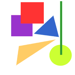
We are using three shapes to begin with, as shown in image 1. Image 1 has no composition; we have just lined the forms up from left to right. In image 2 we have committed our first act of composition by moving the forms around, resulting in a somewhat more harmonious picture compared to image 1.
1
2
3
4
5
6
In image 3 we have introduced the green at the top left. Green and yellow are related colors, so we move the green bar over to the yellow disk. In image 2 and 3 the blue triangle didn't seem to point in any particular direction, but by moving the green bar like in image 4, it looks as if the blue triangle is pointing from top left to bottom right. We reinforce this effect by moving the blue triangle closer to the point where the green bar intersects with the yellow disk (image 5). This represents one of the most important aspects of composition: lines of action, in this case from top left to bottom right. In image 6 we have moved the red square along this line of action.
7
8
9
10
11
Okay, let's add another object. We add a purple square, as shown in image 7 and images 8 to 11 show how different positions of the new object affect the image. If we thought that composition is about filling empty spaces, then we would move the purple square to left bottom left corner, as in image 8. This doesn't look right, because there is no connection between the purple square as the other forms. Let's get back to image 6. Note how focusing on the blue triangle enables you to see all forms in one glance, while in image 8 you have a tendency of moving your point of view from the purple square to the other forms and back, trying to understand what you're looking at.
Image 6 has a center (the blue triangle), while the center of image 8 lies somewhere between the blue triangle and the red square (where the black dot is, in the image on the left), so the center lies in an area of white space. Try focusing on image 8's center and you'll see all shapes without having to move your point of view, but you will still be wondering what the purple square is doing in the bottom left corner. Image 6 is rather pleasing on the eye because the blue triangle is immediately recognized as the center of the image, while in image 8 you have to move your point of view several time before you have found the center of the image (i.e. the point that allows you to see all forms in one glance). Making a picture easy to understand, that's what composition does.
So now we know that we have to connect the purple square to the other forms, we move it closer, as in image 9. As shown on the left, the center lies on our main line of action, but the blue square next to the yellow disk looks very awkward. We try moving the purple square up to the red square, which creates a second line of action, but now the center is off the first line of action. We fix this by moving the purple square as in image 10 and lo and behold, the center is back on the first line of action and the second line of action is now almost perpendicular to the first, see the image below.
Next we introduce another form which moves the center of the image to the center of the blue triangle, as seen in image 12. We feel that the left end of the new shape is left hanging in space, so in image 13 we add a dark-purple rectangle to support the new triangle.
12*
13*
12
13
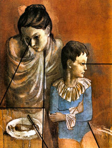
In the images above I used very simple shapes, leading to a pretty lame art work, but the above-mentioned principles are used in almost every style of painting. Take for instance Picasso's painting Sad Mother with Child.
Because the pair isn't moving, Picasso had to use lines of action that suggest a static situation. The boy needs space to his left side (right side from our perspective) so that the line of action associated with his field of view can develop to the right. If the woman were also looking to the right that would suggest horizontal movement, which conflicted with the static situation, creation confusion. The line of action associated with her field of view must be able to develop, so instead of making her look straight to the left (where the canvas ends), Picasso makes her look to the left and down. This line of action balances that of the boy's and the net result is a static situation, which is confirmed by the vertical line of action through the middle. The line of action created by the knife opposes the line of action associated with the woman's field of view and serves to add more dynamism to an otherwise too static composition. The horizontal line of the table confirms and support the horizontal of the boys line of view.
"So what's the big deal?", I can hear you think. "You've showed me what composition is, SO WHAT?". Well, first take another look a image 13, from our composition example. It's hardly a masterpiece, but it does look clean, which is a result of the strict composition. More importantly, it invites to do more. Because it's a well-organised image that doesn't confuse, it's relatively easy to add another form, in other words: to expand the composition. If you don't take care of your painting's composition then you will get stuck much sooner, and reach the point that you don't know how to go on.
When I prepared the above composition example, I was guided just by intuition, and only after the fact I analyzed what I had done. This shows that there is much more logic to intuition that one might think, but the morale is that because of the logical organization of the composition, you are making it easier for yourself to understand your own art work, and thus to elaborate on it. By the same token it's a good idea to be neat, just because that makes your painting easier to understand. The more inaccuracies and irrelevant details, the messier your painting becomes and the easier the eye gets confused. Personally I alternate spells of wild gestures with smooth finishing. If you want to be expressive then you can't get around incorporating an element of chance (or noise) in your painting, but at some point your art work becomes such a mess that creativity comes to a grinding halt and you don't how to go on. What you should do is try to eliminate irrelevant details, by neatly overpainting them. This should simplify your painting, because with fewer details your brain needs to expend less computing power on trying to make sense of what you're looking at.
The style of our composition example could be called geometric abstraction and Picasso's example is figurative art, both styles which are comparatively easy to compose. Modern abstract art however, departs from the traditional rules of composition and no lines of action can be discerned. In that style you're completely at the mercy of your own intuition, but on this page I'm hoping to teach you how to think in terms of composition and make you understand what it's for.
A good example of modern abstract art is abstract expressionism, a style in which an artist tries to paint without creating a global composition. On every level of the painting (both locally and globally) he tries to create contradictions, such that the painting as a whole is well balanced. So as to not get you too hung up on composition, we now move into the realm of abstract expressionism, which can be a fresh wind compared to the strict rules of traditional composition.
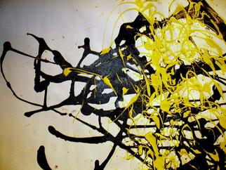
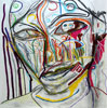
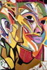
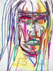
I have included some images of paintings of the young abstract expressionist Mike Wong Joon Fong because it's such a good example of how a modern abstract painter works. Look at the way Mike has been dripping the paint onto the paper, first the black and then the yellow, resulting in a particularly attractive counterpoint of two colors. The reason why it looks so nice is that Mike has expressive talent on which he is relying completely in this painting, but if he ever wants to make his mark in the world of art he will have to make more paintings like his Unveiling, below, left.
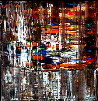
The oil paint had already dried when he scraped off the bottom third of top the top layer and I think I see some vertical scratches in the top part too. Apparently Mike had been looking at his painting for while, was dissatisfied with it and then he got an idea and started scraping. Compare this to .....
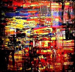
.... his painting Do not be afraid above, right. Fine painting, but not nearly as interesting and powerful as Unveiling. The morale is that with the scratching in Unveiling Mike has given his painting a completely new turn that has increased it's expressive strength and depth. The increased compositional balance makes Unveiling more pleasant and relaxing to watch than Do not be afraid. So do not be content with your art work too easily. If you see room for improvement, rework the painting.


 12*
12* 13*
13*